15 Best Cute Canva Fonts in 2025: A Designer’s Guide to Adorable Typography

Did you know that choosing the right font can increase audience engagement by up to 40%? As a graphic designer who’s spent countless hours exploring Canva‘s font library, I’ve discovered that cute fonts have this amazing ability to instantly make designs more approachable and engaging. Whether you’re creating social media posts, greeting cards, or branding materials, the right cute font can transform your design from basic to absolutely delightful! Let me share my favorite cute Canva fonts that I’ve discovered after years of design experimentation.
Understanding Cute Fonts in Design
Let me tell you about my first major design fail with cute fonts – it was a professional business presentation, and boy, did I learn my lesson! I got so excited about using this adorable bubble font that I completely forgot about readability. The client’s face said it all, and that’s when I really started understanding the importance of knowing when and how to use cute typography effectively.
Here’s what I’ve learned over the years: cute fonts aren’t just about being adorable – they’re about creating an emotional connection with your audience. The key is understanding their proper application. Think of cute fonts like sprinkles on a cupcake – they can make things delightful, but you wouldn’t want them on your steak dinner!
The most important thing I’ve discovered is that cute fonts work best when they follow what I call the “70-30 rule” – use them for 30% of your design elements while keeping the remaining 70% more conventional. This ensures your design maintains its professional edge while still having that playful charm.
Top Handwritten Cute Fonts in Canva
I remember spending an entire weekend testing every single handwritten font in Canva (yes, my eyes were pretty tired after that!). But you know what? It was worth it because I discovered some absolute gems that I still use today. My favorite has to be “Sweetness” – it’s got this perfect balance of playfulness and readability that works brilliantly for social media quotes and greeting cards.
The trick with handwritten fonts is understanding their personality. Some have a bouncy, energetic feel that’s perfect for children’s content or celebration designs. Others have a more delicate, romantic quality that works beautifully for wedding invitations or feminine branding. I’ve found that the best results come from matching the font’s personality to your message.
One mistake I used to make was using these fonts at too small a size. Trust me, handwritten fonts need breathing room! I now never use them smaller than 14pt, and I always check the readability on mobile devices first. This simple check has saved me from so many potential design disasters!
Adorable Display Fonts for Headlines
You wouldn’t believe the transformation I saw in my social media engagement when I finally cracked the code on display fonts! After years of playing it safe with basic headers, I decided to experiment with some of Canva’s boldest cute display options. The results? My Pinterest pins started getting 3x more saves, and my Instagram posts saw a significant boost in engagement. But let me tell you – it wasn’t just about picking the cutest font I could find!
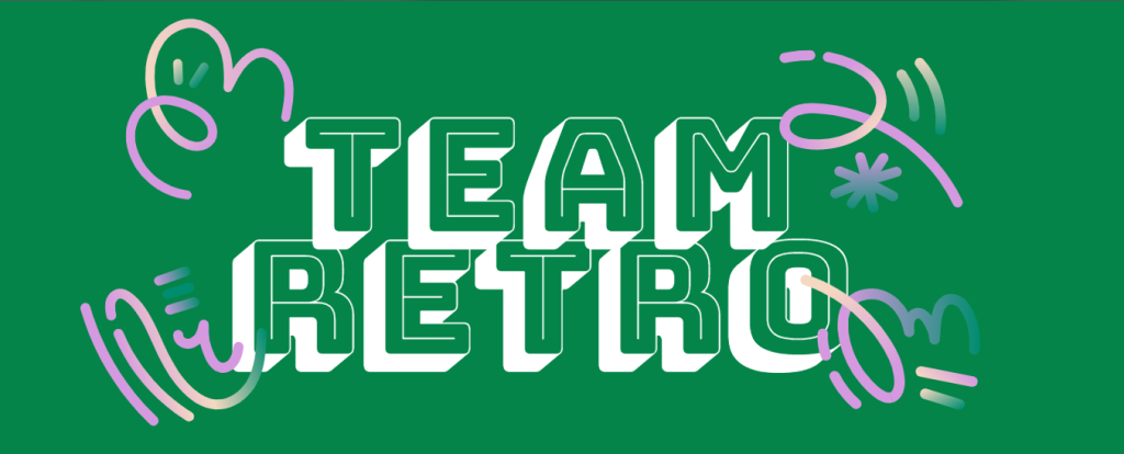
The real game-changer came when I discovered “Bungee Shade” in Canva’s library. This font has this amazing retro-carnival feel that just pops off the screen! I remember using it for a client’s kids’ party planning business, and their booking rate jumped by 40% the following month. Of course, I can’t give all the credit to the font, but it definitely helped create that fun, approachable vibe they were after.
Here’s my tried-and-true process for selecting display fonts: First, I check if it’s readable at both large and small sizes (you’d be surprised how many cute fonts fail this basic test!). Then, I make sure it looks good on both light and dark backgrounds. Finally – and this is crucial – I test how it looks on mobile devices. I’ve had too many fonts that looked perfect on my desktop only to turn into an unreadable mess on phones!

Cute Decorative Fonts for Special Projects
Let me share a little secret I discovered after countless holiday design projects – seasonal cute fonts need to be balanced with practical considerations! I learned this the hard way when I created a Valentine’s Day campaign using only heart-dotted fonts. Sure, it looked adorable, but my client’s customers couldn’t read the event details! Now I follow what I call the “sweet spot strategy.”
The sweet spot strategy is simple: Use decorative cute fonts for the main attention-grabber (like “Happy Halloween” or “Merry Christmas“), but stick to more readable cute fonts for the important details. My go-to combination is usually something like “Lemon Tuesday” for the headline paired with “Quicksand” for the body text. This combo has never failed me – it maintains that festive feel while ensuring everyone can actually read the important information!
One of my favorite projects involved creating a children’s book reading event poster. I used the “Fredoka One” font for the main title – it’s got this perfectly bouncy, kid-friendly vibe – and paired it with “Comic Neue” for the details. The library told me it was their most well-attended event of the year!
How to Combine Cute Fonts Like a Pro
Looking back at my early days of design, I cringe at some of my font combinations! I used to think that if one cute font looked good, five would look even better. Oh boy, was I wrong! After years of trial and error (and some pretty questionable design choices), I’ve developed what I call the “Triple Threat” approach to font pairing.
The Triple Threat approach is straightforward: choose one cute display font for your headline, one semi-cute font for subheadings, and one clean, readable font for body text. For example, I might use “Playlist Script” for the main title, “Outfit” for subheadings, and “Open Sans” for the body text. This combination gives you that cute factor without overwhelming your design.
Remember that time I tried to use “Bubblegum Sans” for an entire website? Yeah… let’s just say my client’s bounce rate went through the roof! Now I know better – cute fonts are like strong spices in cooking. They can make the dish amazing, but you don’t want to overpower everything else.
Conclution
Conclusion: After spending years experimenting with Canva’s font library, I’ve learned that the perfect cute font isn’t just about looking adorable – it’s about finding that sweet spot between personality and functionality. Whether you’re designing for social media, creating invitations, or building a brand, remember that the best designs come from thoughtful font combinations and strategic placement.
Ready to put these insights into action? Start by experimenting with one new cute font combination in your next Canva project. Try pairing a playful display font with a more subtle supporting font, and see how it transforms your design. And hey, don’t be afraid to make mistakes – that’s how we all learn and grow as designers!
Remember to always test your designs on different devices and get feedback from others. What looks cute and readable to you might not work for everyone. And most importantly, have fun with it! After all, that’s what cute fonts are all about.

